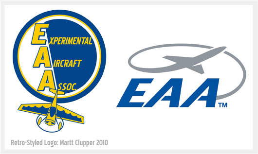
Poll: Which Logo Best Represents The Experimental Aircraft Association?
 Monday, October 29, 2012 at 09:23AM
This is the same poll I put up almost a week ago in 3 Reasons Why I Should Be The New EAA President (And 3 Why It'll Never Happen), but the poll wasn't the focus of that post so I thought it might be good to make it easier for people to find it. Almost 200 votes have come in since last Tuesday and I have been extremely pleased to see that my retro logo is currently running at over 82% favorability! I'd like to see where the numbers are at with about 1,000 votes, so if you haven't voted in this poll yet, please do.
The real purpose for this poll isn't to see if my particular version of the old original EAA logo is better liked than the the current one, it's really about seeing if there's a real desire within the EAA membership to see the organization return to its roots. That doesn't in any way mean shunning new technology for homebuilt aircraft, it's really all about how the organization is run and what it considers its primary mission to be. In my opinion, the EAA of 1970 was doing a much better job of representing its members than the EAA of 2012... and the logo battle is a pretty good graphic representation of all that.
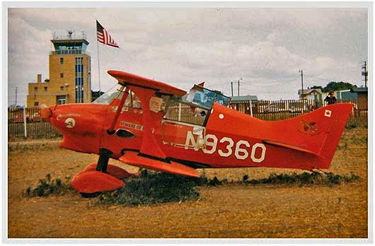
 Oshkosh 1970: grass trampled around Ray Hegy's one-of-a-kind El Chuparosa
 Martt |
  9 Comments |


Reader Comments (9)
It's true, I forgot to actually include the 'poll' when I posted this earlier today... I'm pretty heavily doped up on Vicodin for some serious sciatic nerve pain that I've been having (and the steroid shot I got last Wednesday hasn't helped yet like I had hoped) - and in my rush to get off to my day job I forgot to include the poll. But it's here now : )
Could you guys tell me what's so amazing about the retro logo? For me experimental aircraft should look into the future, and the results of this poll are kind of surprising...
zbyhu- You have a good question, and some of it is answered both in the text here in and the text of my post '3 Reasons Why I Should Be The New EAA President... but I'll add some additional details with these three major points to consider. Hopefully this info will help you to understand why many of us see the retro logo as being superior:
1) The EAA began in 1953 and the vast majority of the aircraft being build back then were very grass-roots oriented. The airplanes were simple and their designs would definitely fall into the 'retro' look today. For many EAA members like myself, the original logo (and thus my retro logo too) represents the fabulous heritage of where the EAA came from. Grass-roots pilots building affordable airplanes in their garages. And while it's not unusual for some homebuilt airplanes today to cost $300,000 to get into the air, that doesn't represent the 'typical' member on a quest to build an affordable airplane he can fly himself. There's nothing wrong with the fast and fancy $300,000 homebuilt, but that's not the heart of the interest in the membership.
2) The retro logo points to the era when the EAA was focused on supporting the simple idea that some people wanted to build their own airplane. As the years have gone by, the organization has taken on many other responsibilities that aren't necessarily driven by the desires of the members. The retro logo points many of us back the the time when we really felt that the organization was specifically there to support our desire to build and fly our own airplanes, rather than we as members are there to provide the financial resources for the leadership to set about accomplishing their own goals. In reality, the goals that have been pursued aren't 'bad', they just seem at times to have pushed the primary objective to the curb. The retro logo represents a longing for the day when things were different.
3) While some people feel the whole point of building an airplane would be to arrive at some futuristic 'wonderplane', the reality is that pure and simple flying in low and slow or 'old fashioned' nostalgic airplanes will never go out of style. The airplanes from the 1930's and 1940's (and ones styled like them) are still very desirable... and they always will be. Here again, the retro logo points to that reality. Sure, futuristic airplanes are popular too, but 'retro' is universally accepted.
I'll also mention again that I believe a large part of the desire for the retro logo (and thus its popularity) is based on the simple desire for the EAA to be the organization that it used to be thru the 1960's and 1970's.
Martt I voted for the retro logo and have a suggestion.
Granted it is a "style" enhancement but how do you feel about placing the airplane at the top of the logo pointing upward on the same angle as the blue line behind the lettering?
The other logo does invoke an upward feeling.
The rest of your redisign is spot on!
Jim- I like the idea in concept, but because the original EAA logo had the airplane where it is on the lower left, I feel there's just too much heritage with it there to change it. It would be fun tho to draw one up as you suggest and see how it looks.
When was the "old" EAA logo designed?
Tony Fletcher- I believe right around the time the organization was started, 1953.
emyvorti e3d3fd1842 https://social.nichietsuvn.com/trumasrybea
emyvorti e3d3fd1842 https://social.nichietsuvn.com/trumasrybea