


The Thunderbirds Rock, But I Think They Need Some New Paint!
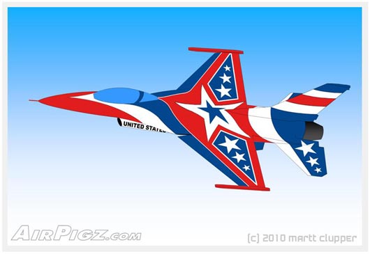 My idea for some hot new 'Superstar' paint for our beloved Thunderbirds
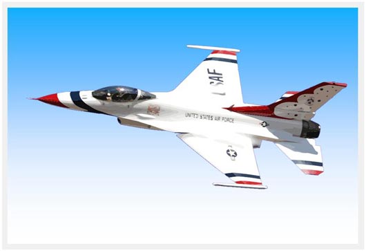 A modified picture of the current Thunderbirds paint scheme.
I've been a fan of both the Thunderbirds and Blue Angels since I was a kid... how are you not a fan of intensely disciplined jet aerobatic teams that make huge noise, fly insanely close together, and represent the U.S. Air Force and U.S. Navy? I've also been very fortunate to have seen both teams within the last year, and in the process, I've come to one simple conclusion: the Thunderbirds need some new paint.
As I mentioned in last week's Thunderbirds CoolPix post, when I saw team perform at Sun-n-Fun this year, the sky was a bit hazy and very white, which made the airplanes very unimpressive looking. The show was great, but I couldn't help but wonder how much more visual impact those intensely blue F-18's from the competition would have looked in that same same sky. So, I thought about it enough to finally let those thoughts boil over and fall out of my head onto the computer screen. As seen above, I present my baseline concept for a high impact, 'Superstar' paint scheme for the Thunderbirds.
I traced the outline of the F-16 from the picture used in the CoolPix and then colored it in based on a design I had worked out on a simple top-view drawing (from a 3-view) using a very red-white-blue theme. Keep in mind I'm a very 2D guy with drawings... it's not a perfect representation here. I call it the 'Superstar' theme since 'stars' are integral to the concept. The one big star on the center of the wing becomes a focal point, and when added to the other stars on the top side makes a perfect 13 stars to represent the 13 original colonies. I technically consider the big star as just one even tho the center of it is a blue star. And, I haven't worked out a bottom view yet, but it would just entail some small evolutionary changes to the pretty awesome 'Thunderbird' already in use.
The modified picture below my drawing shows the current paint scheme for comparison. It's set on the same gradient background to give a little idea of how they both contrast in different sky colors. BTW, the original pic had some noticeable vapor steaks going over the wings that I removed from behind the airplane, but are still there obscuring the USAF markings a little. I also haven't worked in the details of the USAF markings and Thunderbirds logo into my drawing, other than the United States Air Force running down the side of the intake. There's be many details to work out if a design like this was to be adopted, but overall, I'm extremely pleased with the way it looks. I think it's a tremendous improvement.
I was gonna put up a poll to get your opinion on the concept, but even tho AirPigz is getting some pretty good traffic these days, getting people to vote in a poll is a lot harder than it should be. Maybe the poll software isn't working right... please let me know if you've had trouble with other polls. I guess my way of thinking is: why wouldn't you vote in a poll that takes 2 seconds to let you let your opinion be known. I'm a bit of a power-opinionator tho!
Anyway, this time around I thought I'd just ask for you to leave a comment if you have strong feeling pro or con on this concept. I'm always loving me some feedback : )
 Martt
Martt
Reader Comments (5)
I agree with you. The Thunderbirds rock, and they do surely need a new paint design but I think what you have so far is not the way to go. That is by far too flash for a team such as theirs. A nice clean design which still keeps the spirit of the Thunderbird design is in order. Stars and Stripes are nice but not for this bird.
Nice work there, Martt. But... NO! The current paint scheme is the original paint scheme and has over 50 years of tradition built in. Change for change's sake is never good and most especially when one abandons an image rich with tradition.
Csry- I guess I feel like it's time for some flash!
Buck- Thanx for the compliment on the work. I think I'd have to say the current design is similar to the original, but the design has evolved over the years to suit both the airplane shapes and the times. Things are also a lot different these days with both a far greater emphasis on graphic design/corporate identity, and much more competition for the attention of the viewer within pop culture. Since the Thunderbirds (and the Blue Angels) are primarily a PR presence for the branches, now is not only an acceptable time, but possibly an essential time to make sure the visual identity is maximizing its opportunity to connect with the audience. So, as you might expect, I think they should seriously consider and major upgrade. As I mentioned tho, I believe retaining most of the underside 'Thunderbird' graphic concept would be the right thing to do.
I don't agree that the Thunderbirds need a new paint job. Their current look is iconic in that people know at once who and what they're looking at. Their design is classic and simple and works well on a plane travelling very fast. The proposed design from this site looks a little like the Russian and Chinese paint schemes which in turn, look like crap. The simpleThunderbird paint also avoids the cluttered look of a NASCAR racer, which is a good thing. I would keep it exactly as it is.
Yes, there is tradition in the existing paint scheme, but the Thunderbirds departed from it with the T-38 which was, in my opinion, MUCH nicer than the traditional one they went back to on the F-16. It looked modern and gorgeous...even the underside.